Salzburg AG
project tags
Over the past two years, I've been leading the development of a comprehensive design system for Salzburg AG, one of Austria's leading energy and mobility companies.
The project started with a clear mission: to bring consistency, efficiency, and a shared visual language across the company's diverse digital products. From the beginning, my role has been a blend of designer, system architect, and communicator — balancing independent work with close collaboration across multiple product and development teams.
I like to call myself "Mr. In-between" — someone who connects the dots between design and development. My responsibilities include designing components, tokenizing and documenting them, managing design-to-development handoffs, and reviewing final implementations to ensure visual and functional consistency.
Tools and Workflow
My main tool is, of course, Figma. I rely heavily on variables and design tokens, powered by the excellent Tokens Studio Pro plugin. The design library is organized in a single, structured file divided into clear sections:
- Foundations – color styles, typography, spacing, and iconography
- Atoms – basic components
- Molecules & Patterns – complex components and reusable UI patterns
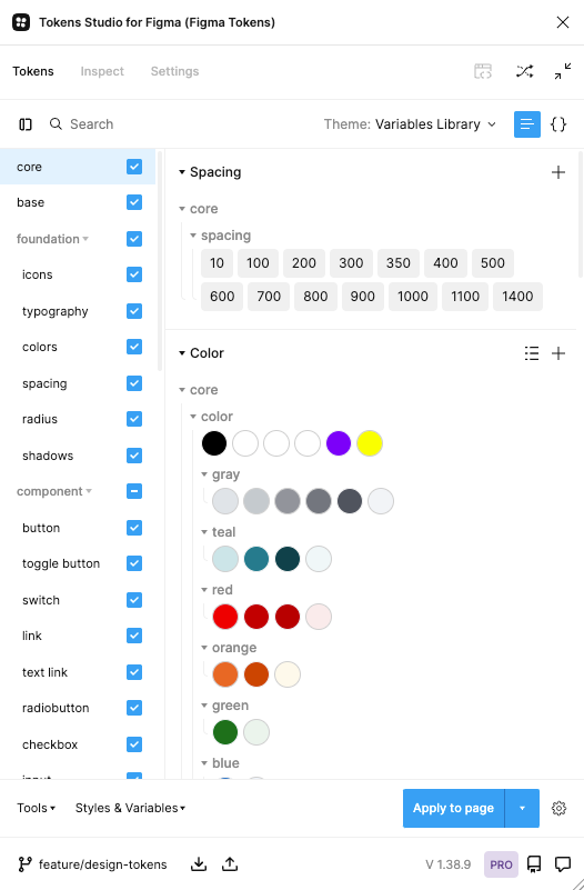
Example of tokens structure created in Tokens Studio Pro
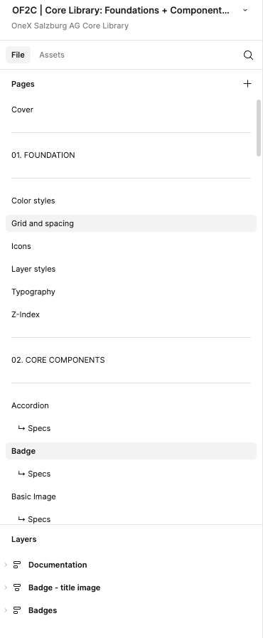
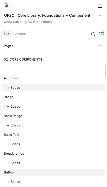
Example of layers naming & structure in the Salzburg AG design system
My workflow goes both ways: sometimes I proactively design missing components (a common challenge in design systems), and other times I respond to specific team requests, deciding whether a component belongs to the core system or should remain product-specific.
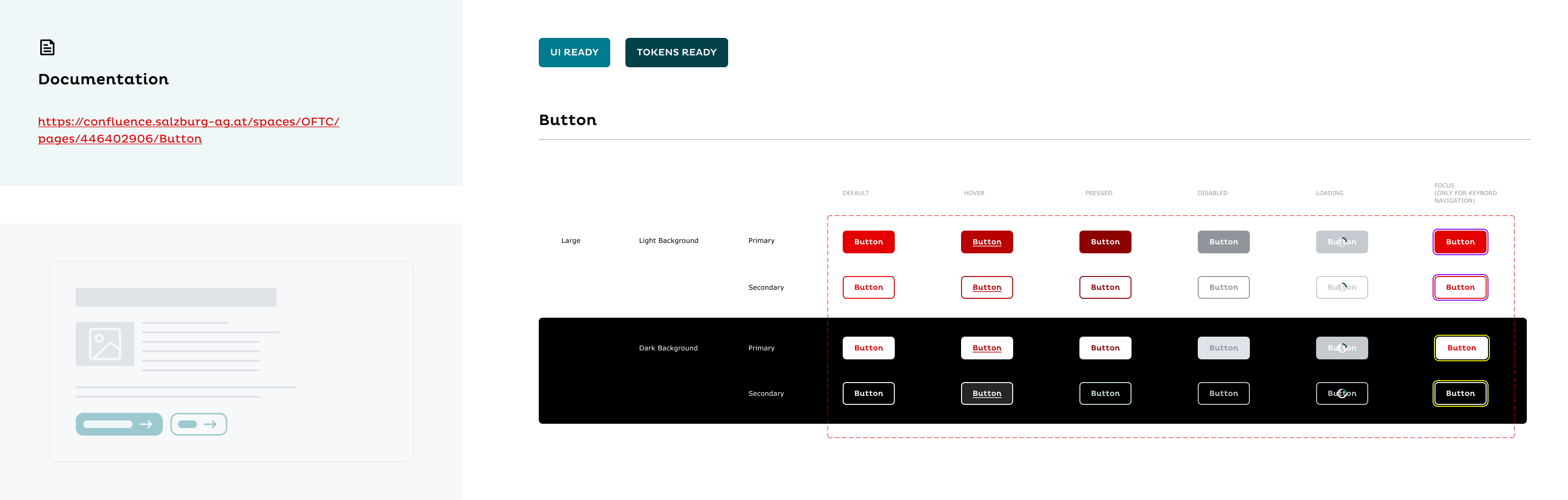
Each new or updated component goes through a review process involving other UX/UI designers and developers. In parallel, I tokenize and document every component using Atlassian Confluence, where our documentation includes embedded Figma frames showcasing component variants, anatomy (thanks to the Specs plugin), usage examples, tokens, and editable elements.
As part of the process, I also verify every component against an accessibility checklist based on WCAG standards, ensuring the design system supports inclusive and accessible user experiences across all products.
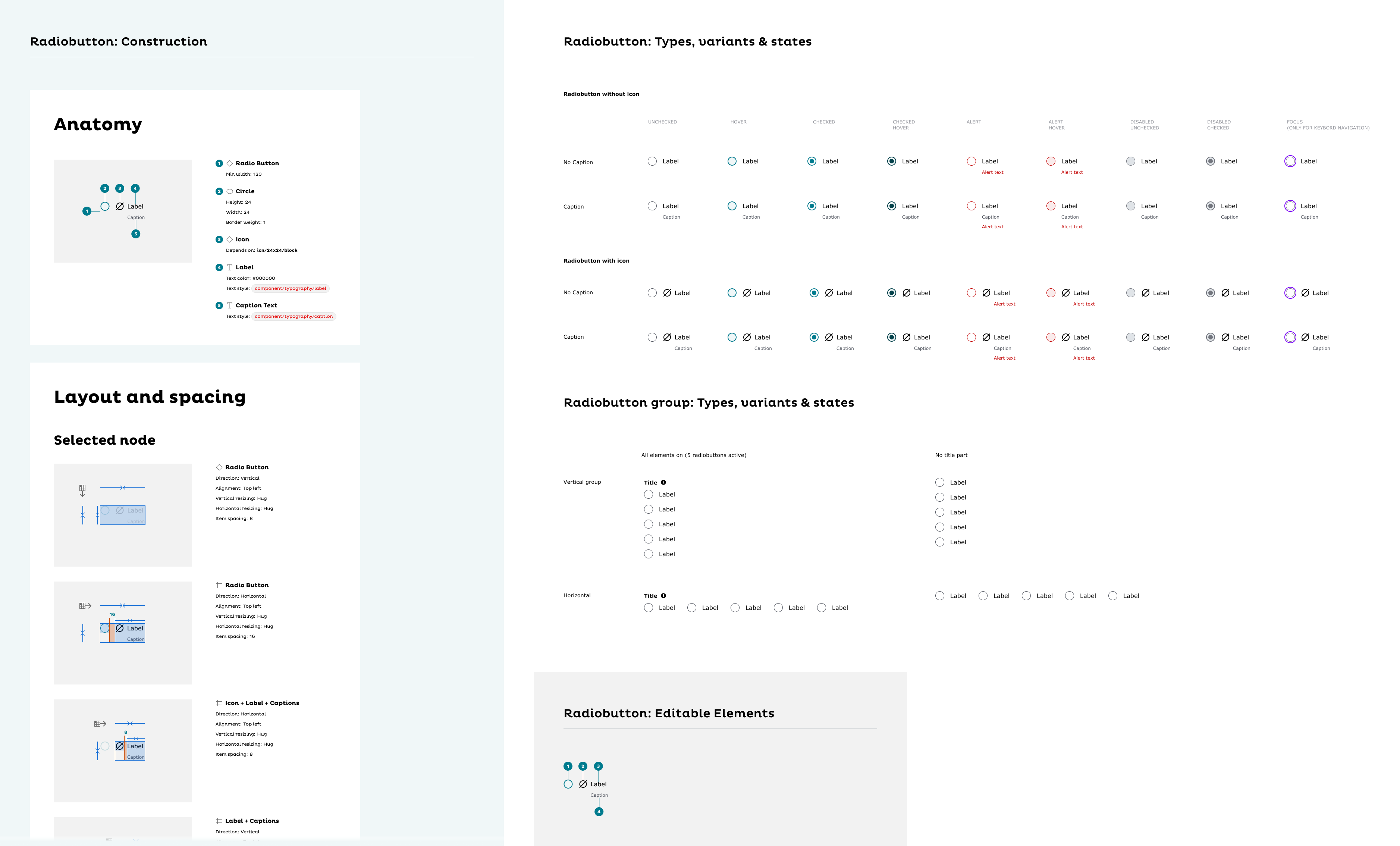
Example of component's assets
Outcome and Learnings
All components are built transparently, clearly named, and organized to ensure long-term scalability. The documentation is detailed yet practical, helping teams work faster and stay aligned.
Although a design system is always a living organism, continuously evolving with new needs and technologies, I believe we’re now close to having a mature, stable version that truly supports Salzburg AG’s digital ecosystem.
In summary this project allowed me to grow as both a designer and a systems thinker — combining structure with flexibility, and creativity with consistency.
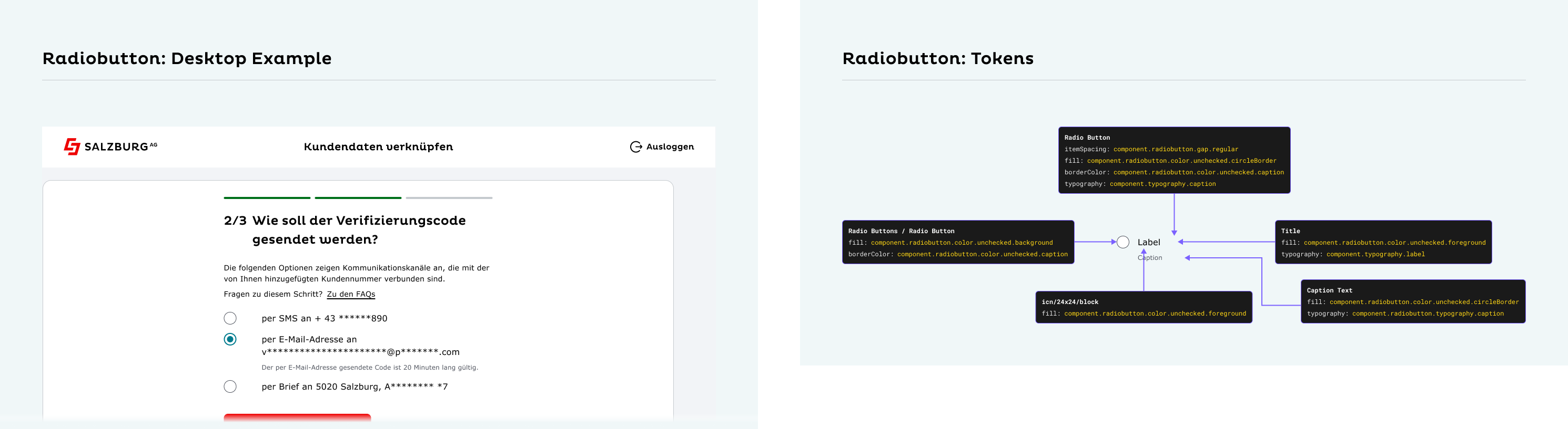
Example of component's assets